By Sternsmith Group
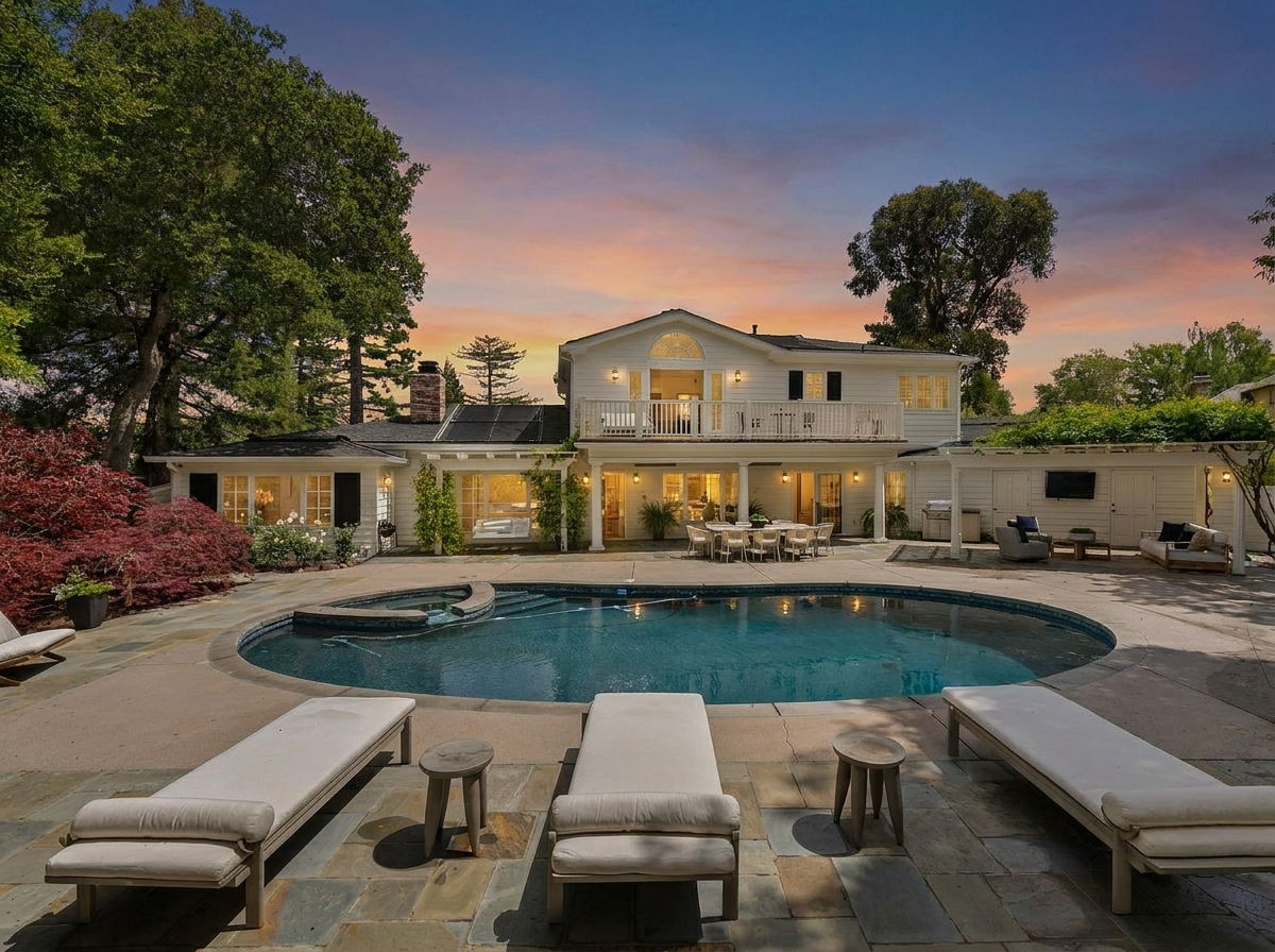
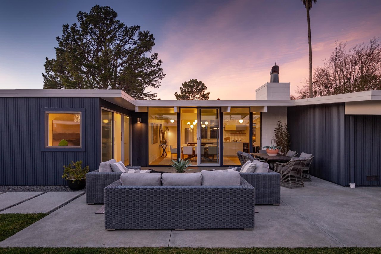
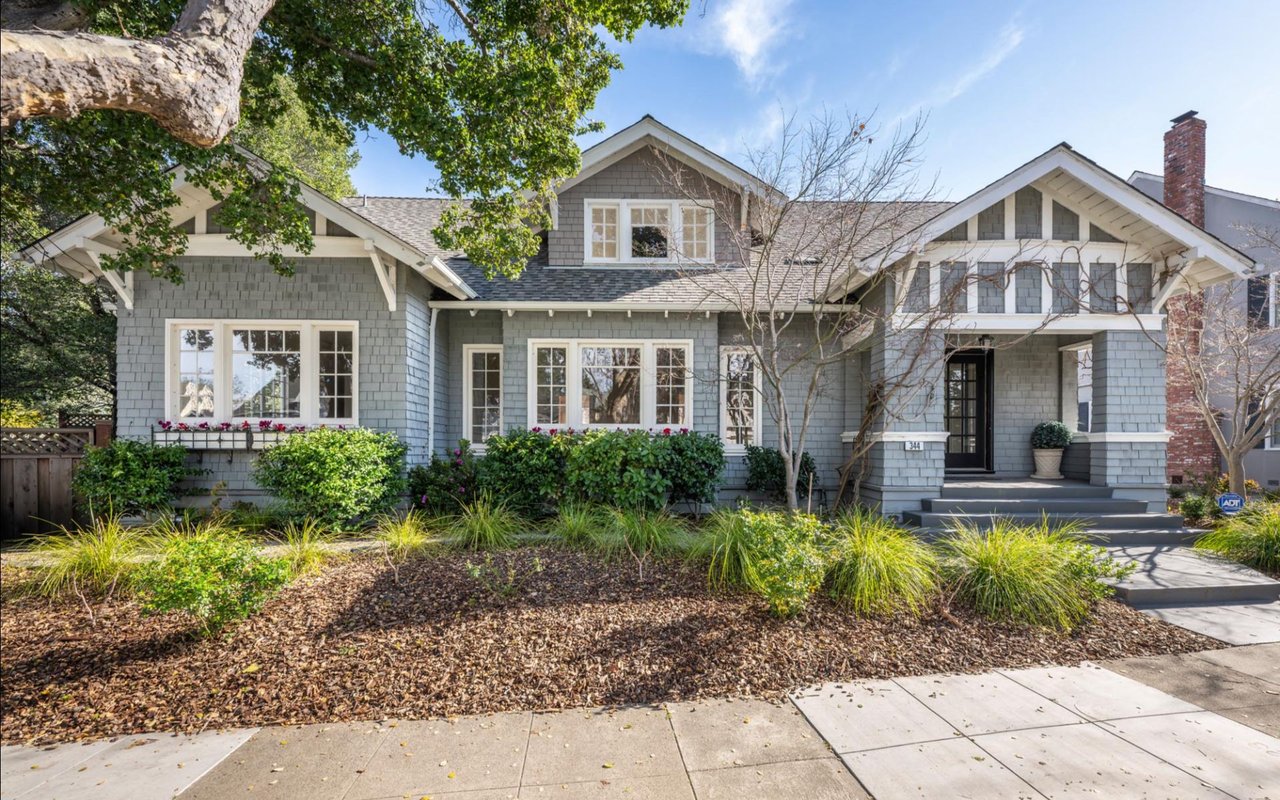
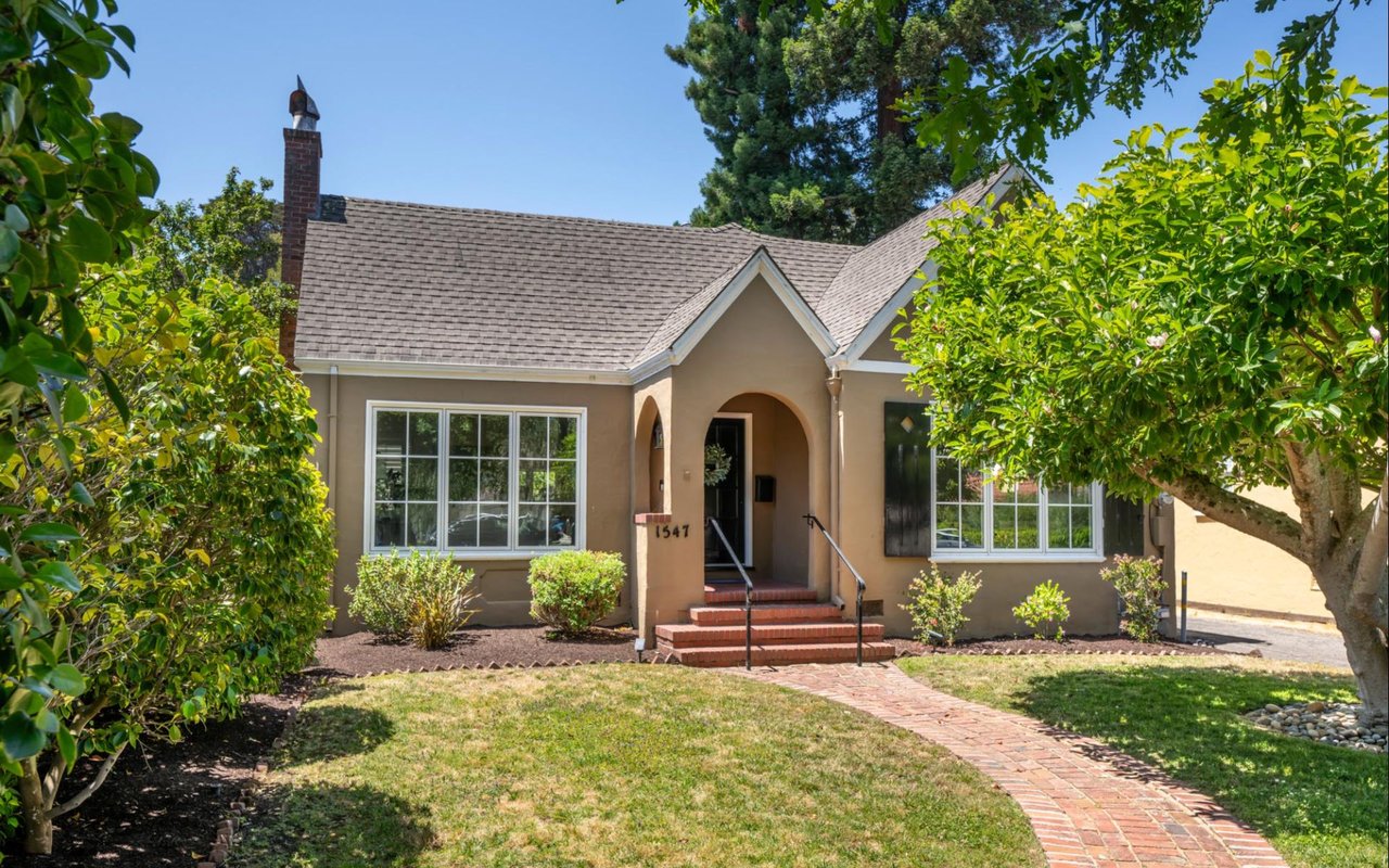
Paint is one of those choices that seems simple until it changes the whole feeling of a home. The right color can make a room feel calmer, brighter, warmer, or more finished before anyone notices the furniture or the view outside. In Burlingame, where leafy streets, older homes, and polished interiors all shape the way a property shows, color has an outsized effect on first impressions.
When people ask us how to choose colors for a room, we usually start with one question: how do you want the space to feel when you walk into it?
Key Takeaways
- Light: Morning, afternoon, and tree-filtered light can change a color dramatically.
- Function: Bedrooms, kitchens, and living rooms benefit from different moods.
- Architecture: Traditional homes and more updated interiors often need different paint tones.
- Flow: Good color choices help the whole house feel connected.
Start With the Light, Not the Sample Chip
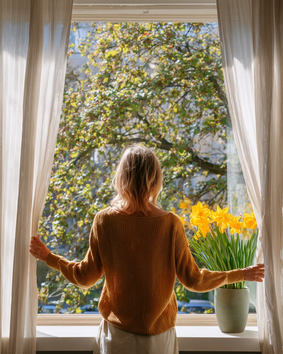
The first thing to study is the light in the room, because light changes color more than most people expect. A shade that looks perfect in a bright paint store can feel dull, cold, or overly creamy once it lands on a wall at home.
The light conditions we check first
- Morning light: East-facing rooms usually feel softer and clearer early in the day.
- Afternoon light: West-facing rooms warm up quickly and can pull more gold from a neutral paint.
- North light: Cooler light tends to make grays and whites feel sharper.
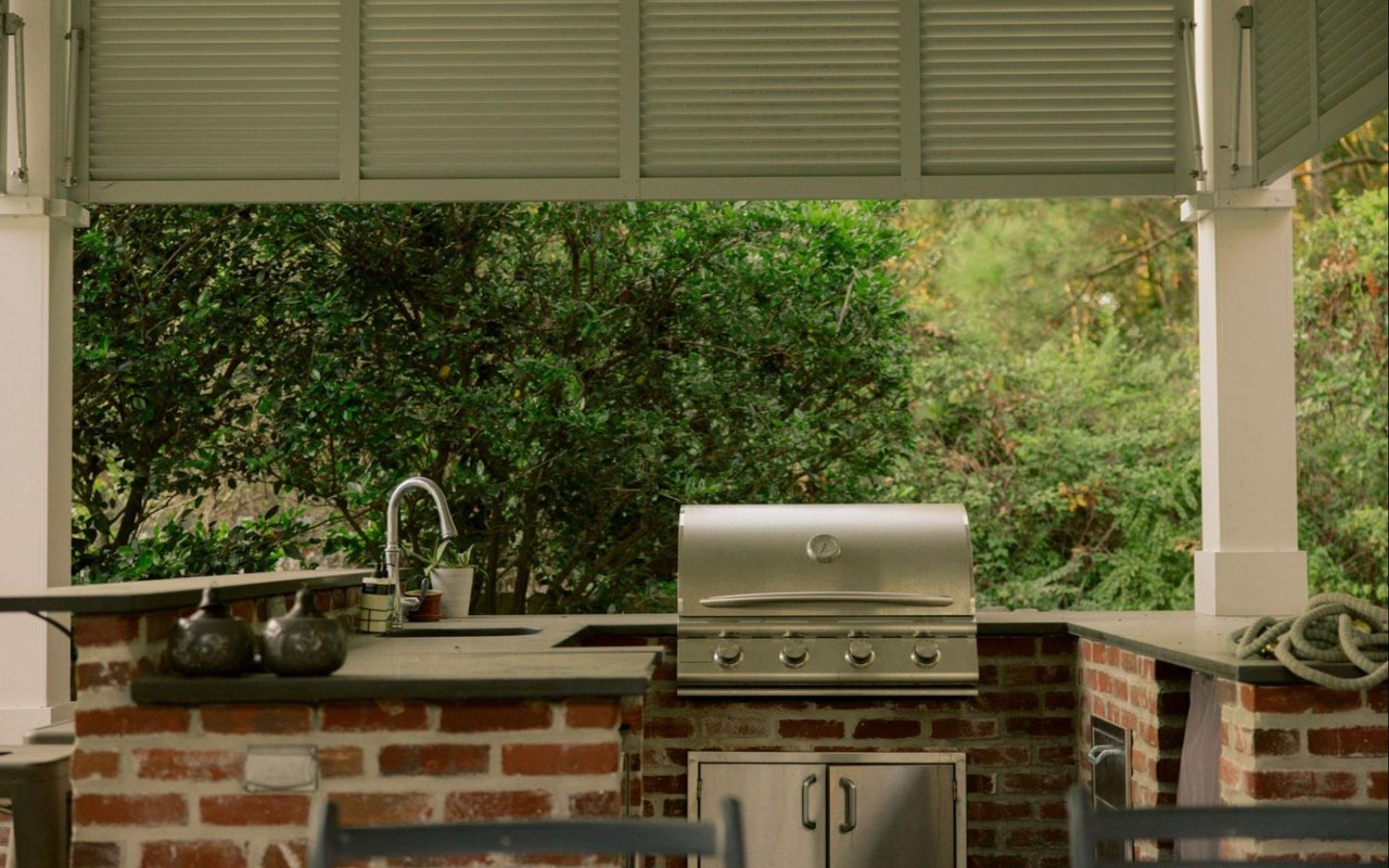
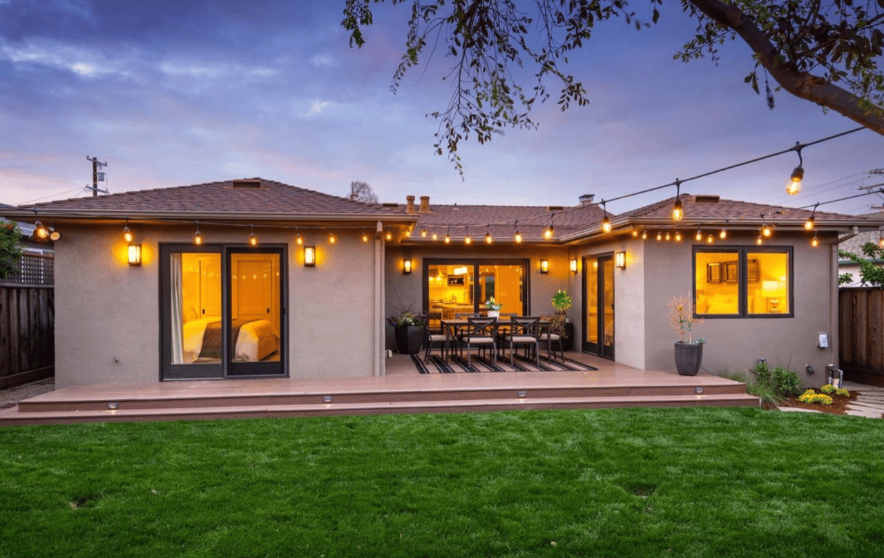
- Tree-filtered light: Burlingame homes often have softened daylight because of mature trees and deeper lots.
This step matters a great deal in Burlingame because natural shade can make a paint tone read darker than expected.
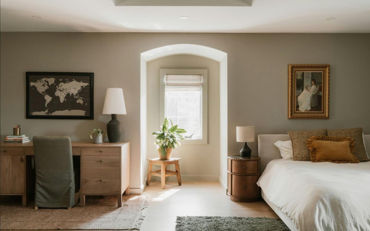
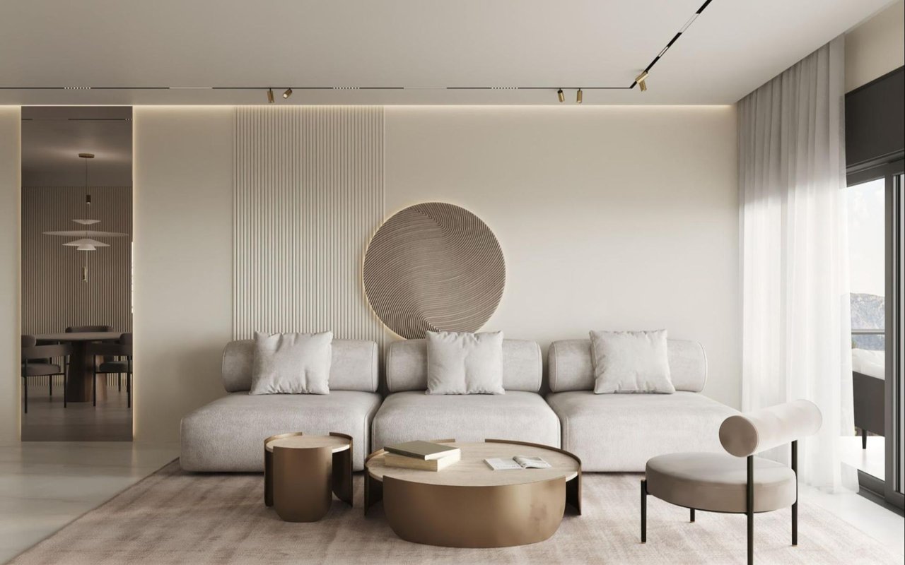
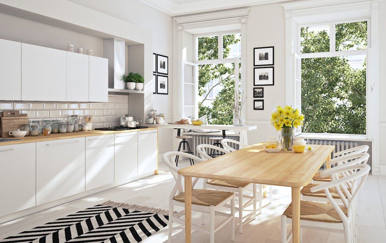
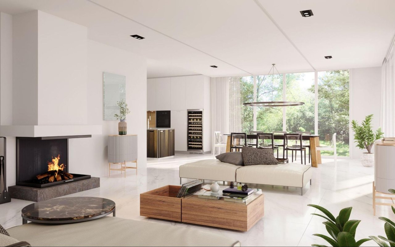
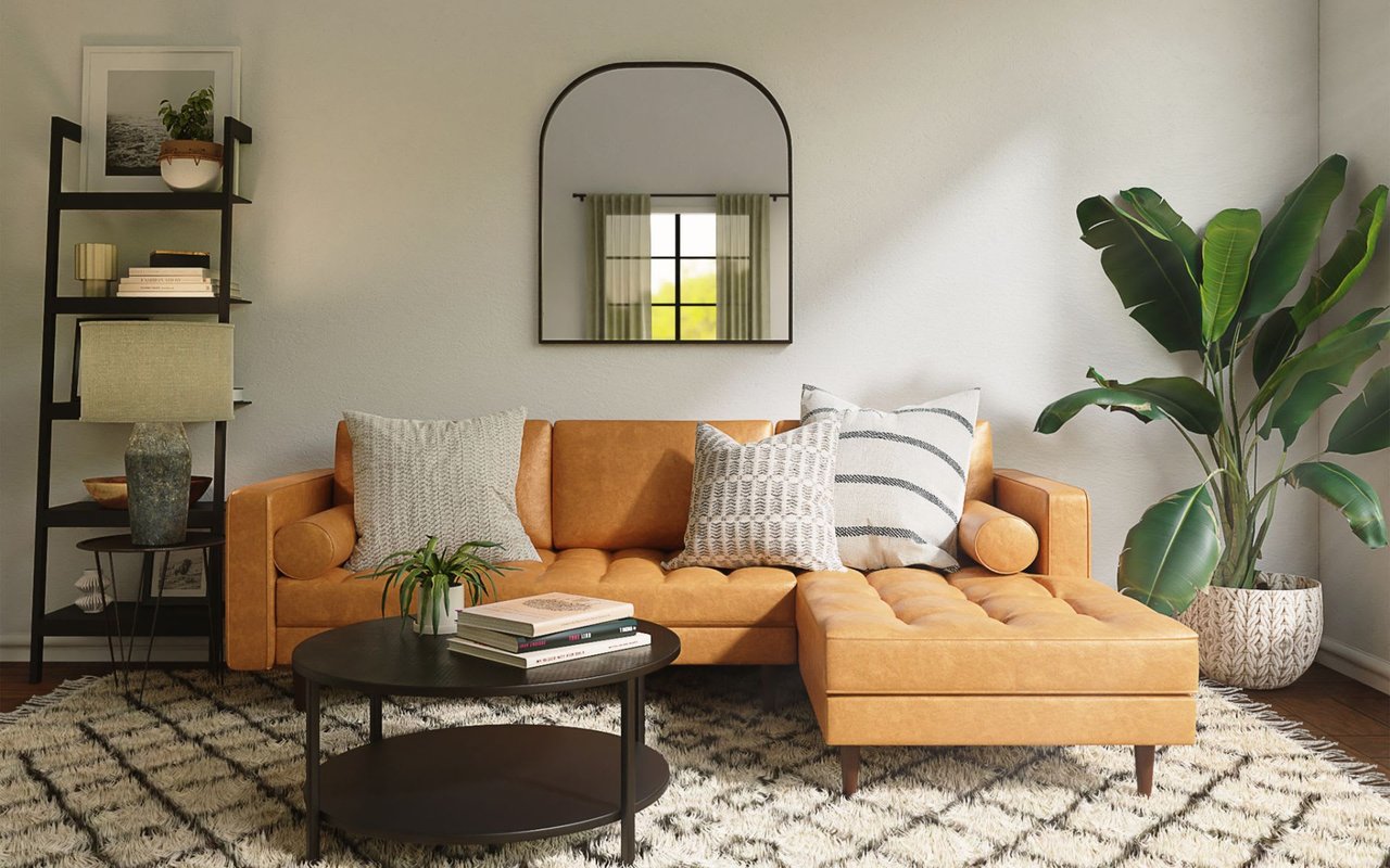
Match the Tone to the Job of the Room
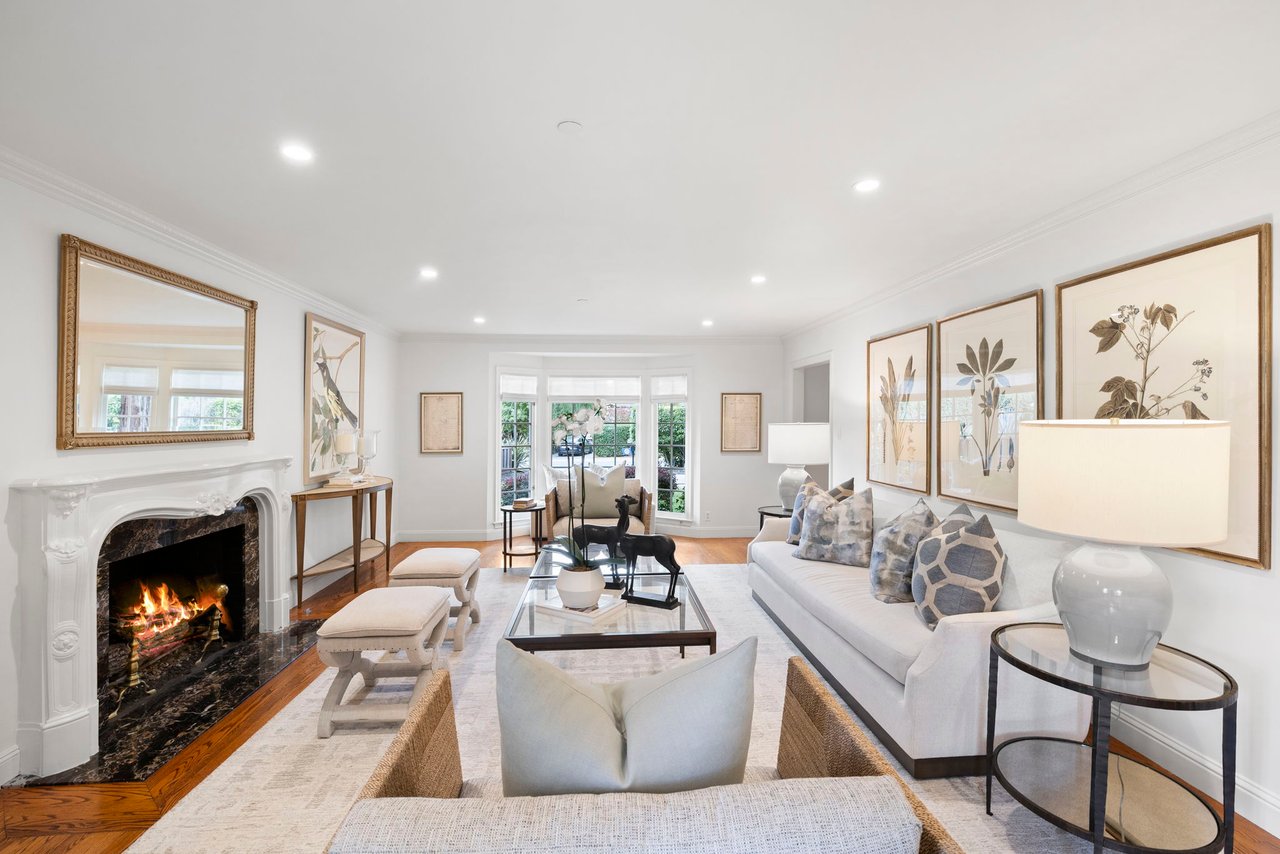
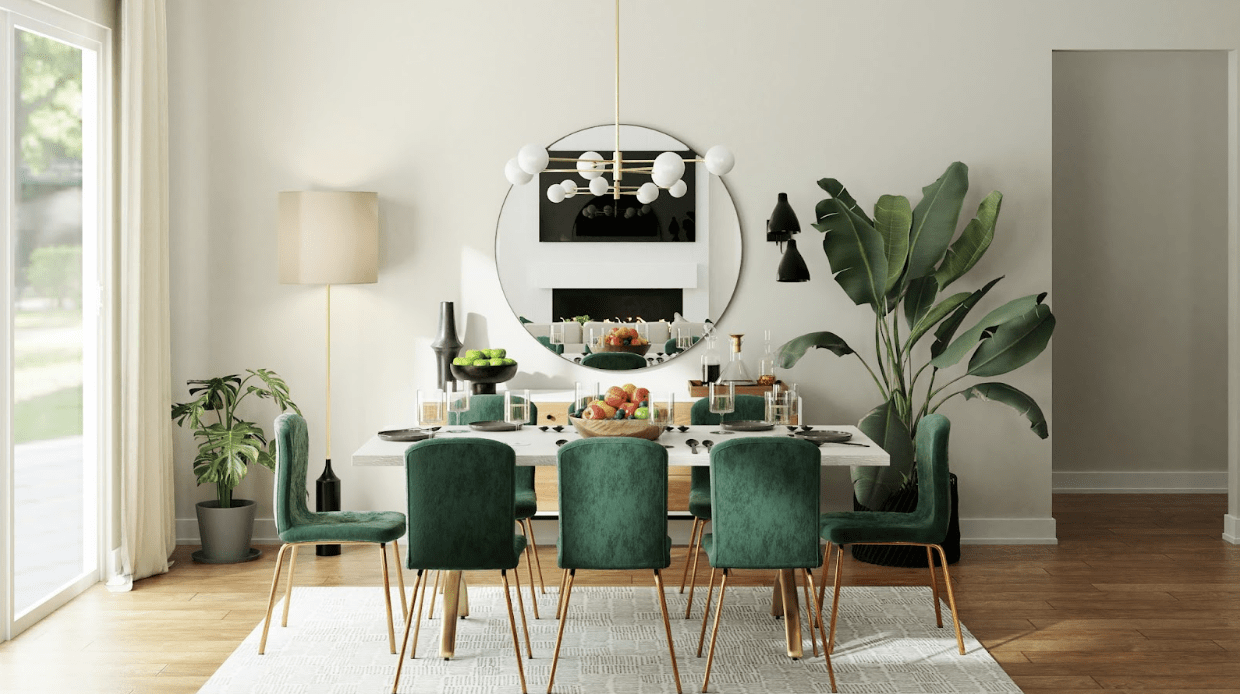
Every room asks for a slightly different emotional tone. A bedroom should feel restful, a kitchen should feel fresh, and a living room should feel inviting enough to hold people comfortably.
How we think about room mood
- Bedrooms: Softer tones usually help the room feel more relaxed and settled.
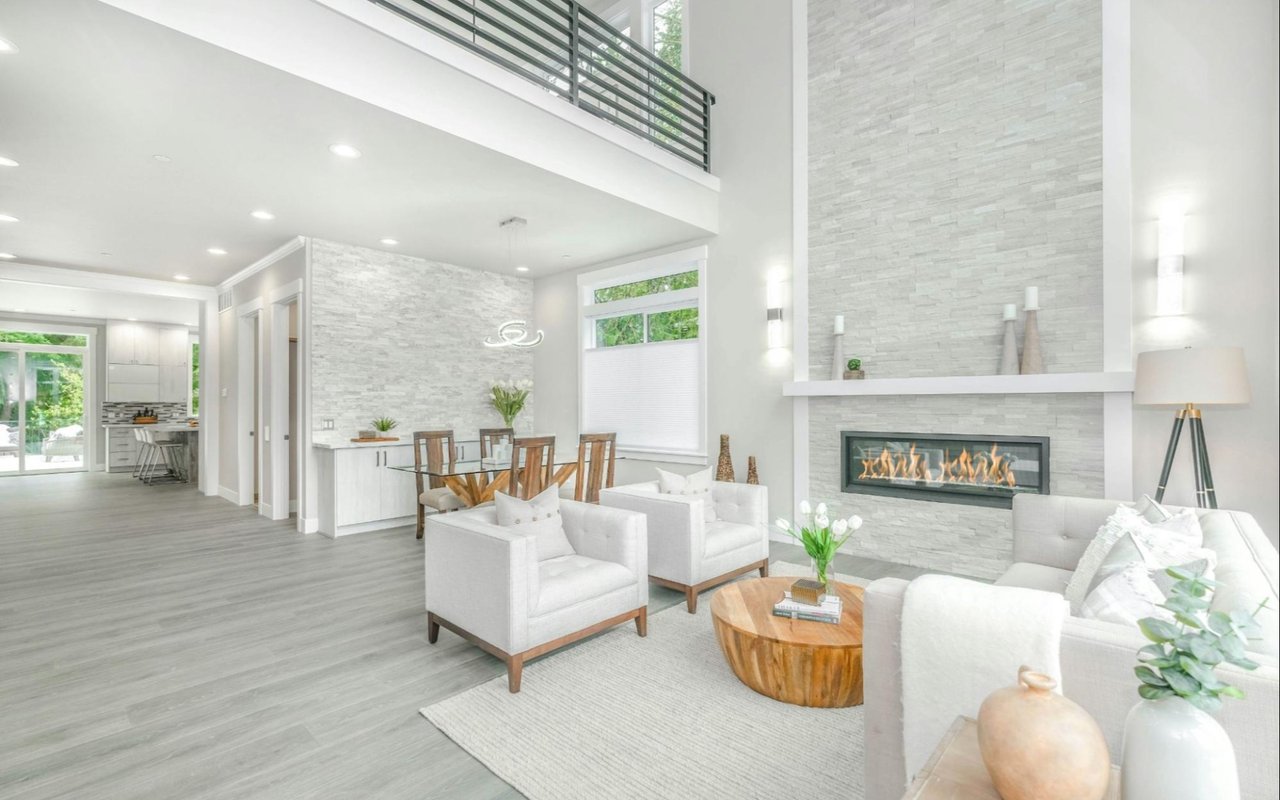
- Living rooms: Warm neutrals often create an easy, polished backdrop for daily life.
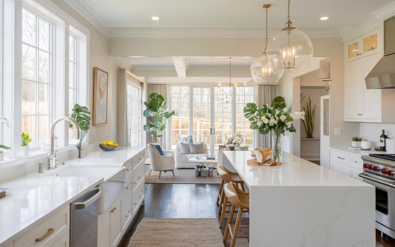
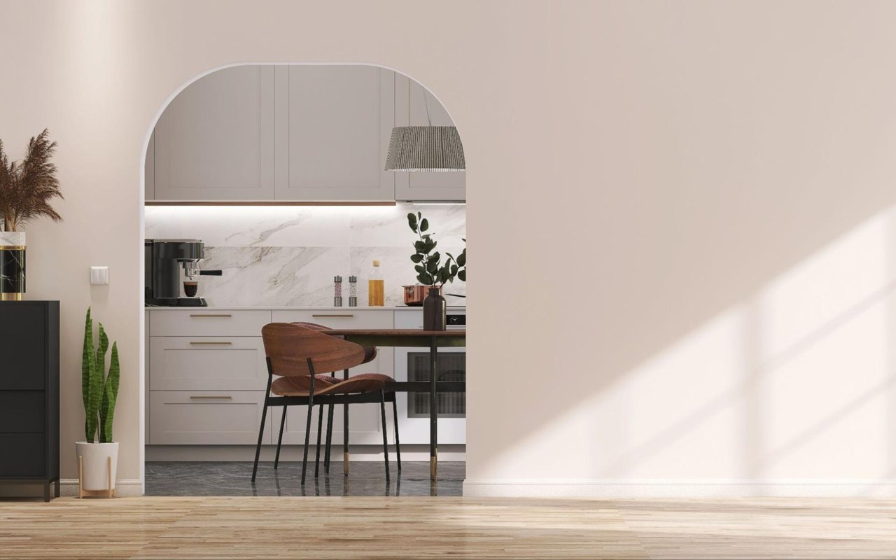
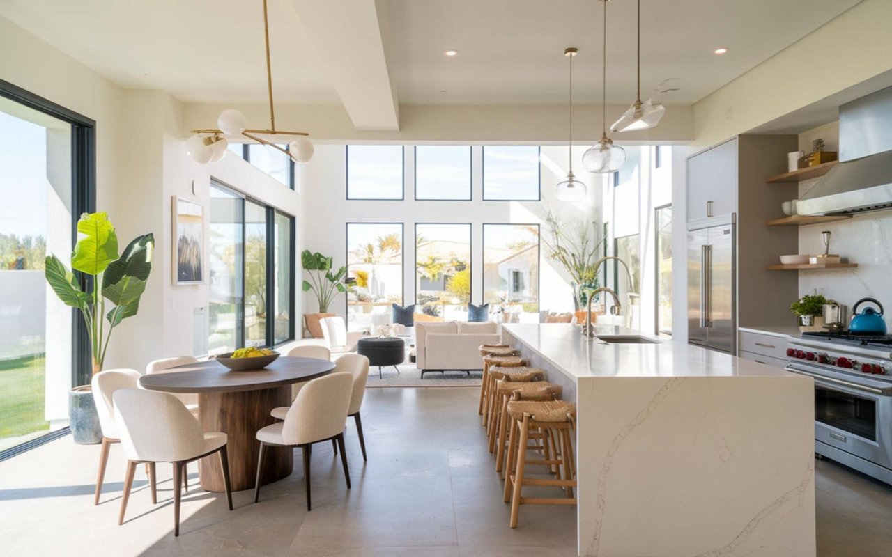
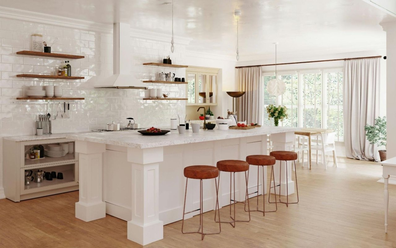
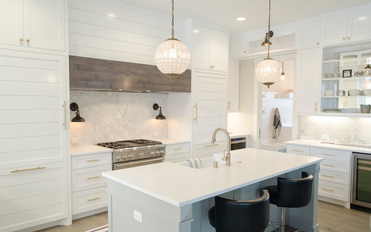
- Kitchens: Cleaner tones can make cabinets, counters, and natural light feel brighter.
- Offices and studies: Slightly deeper colors can make the room feel focused and grounded.
This is where paint becomes more practical than decorative. A room that feels right emotionally usually feels more finished overall.
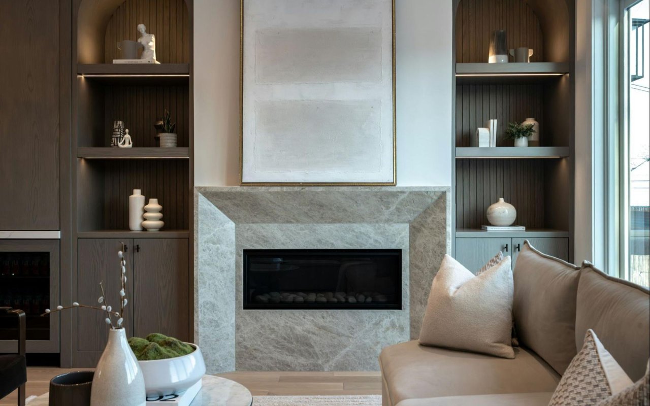
Pay Attention to Undertones Before You Commit
Most paint mistakes come from undertones rather than the main color itself. Two whites can look almost identical on a small sample, then behave very differently once they sit next to wood floors, stone counters, or existing trim.
The undertones we watch closely
- Warm undertones: Yellow, beige, or red bases usually feel softer and more traditional.
- Cool undertones: Blue, green, or violet bases often feel crisper and more modern.
- Balanced greige: Gray-beige blends usually work well when flexibility matters.
- Fixed finishes: Flooring, tile, stone, and cabinetry should help guide the final choice.
This matters especially in Burlingame homes because many properties mix older architectural details with newer updates. Paint should help bridge those elements so the whole room feels cohesive.
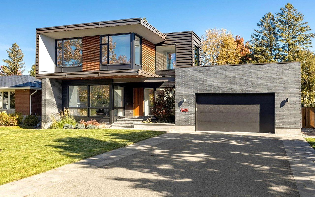
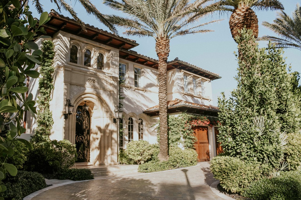
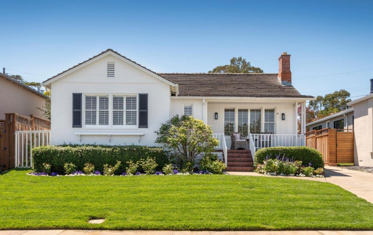
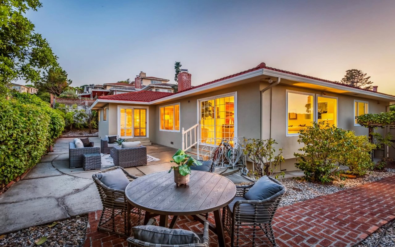
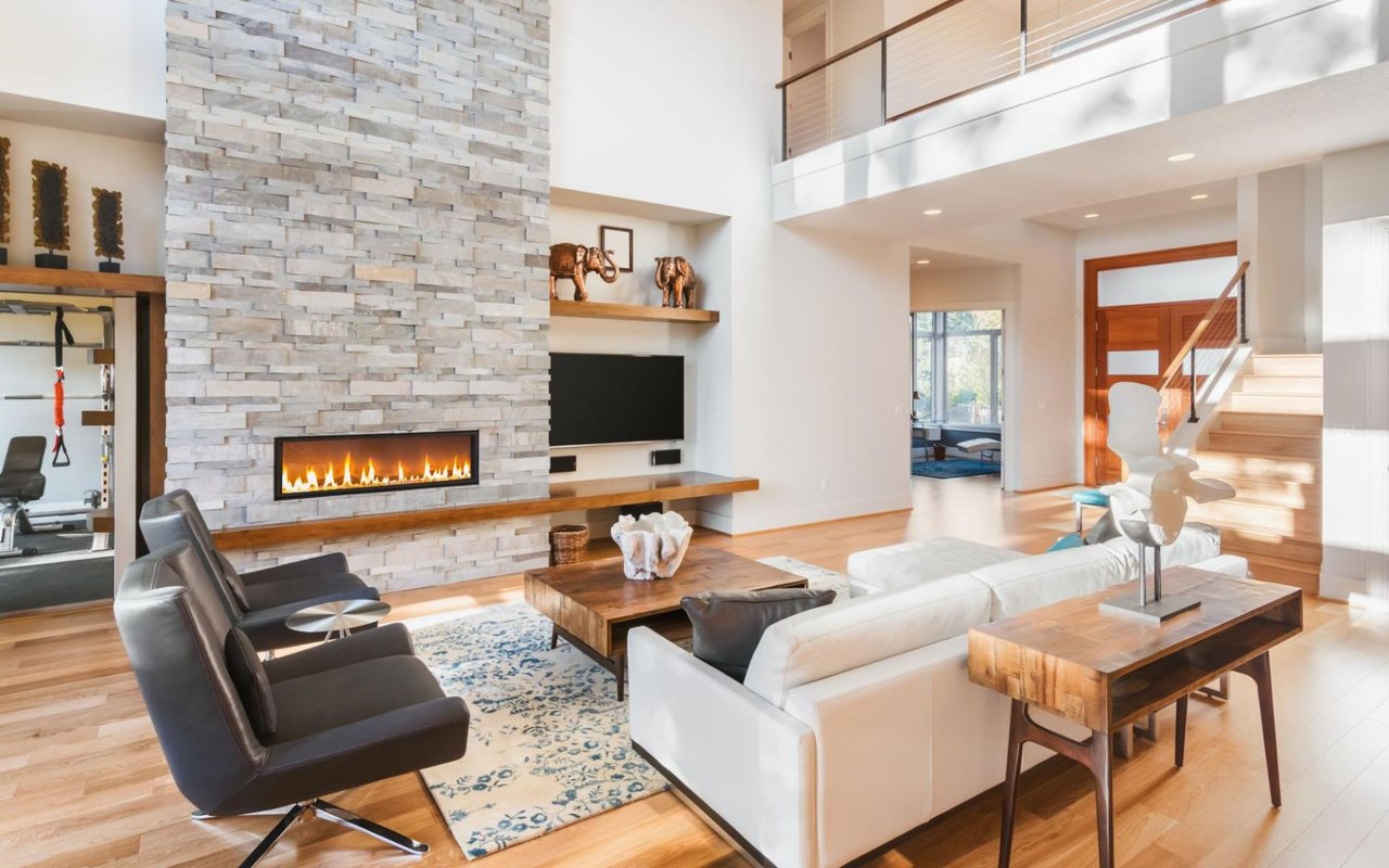
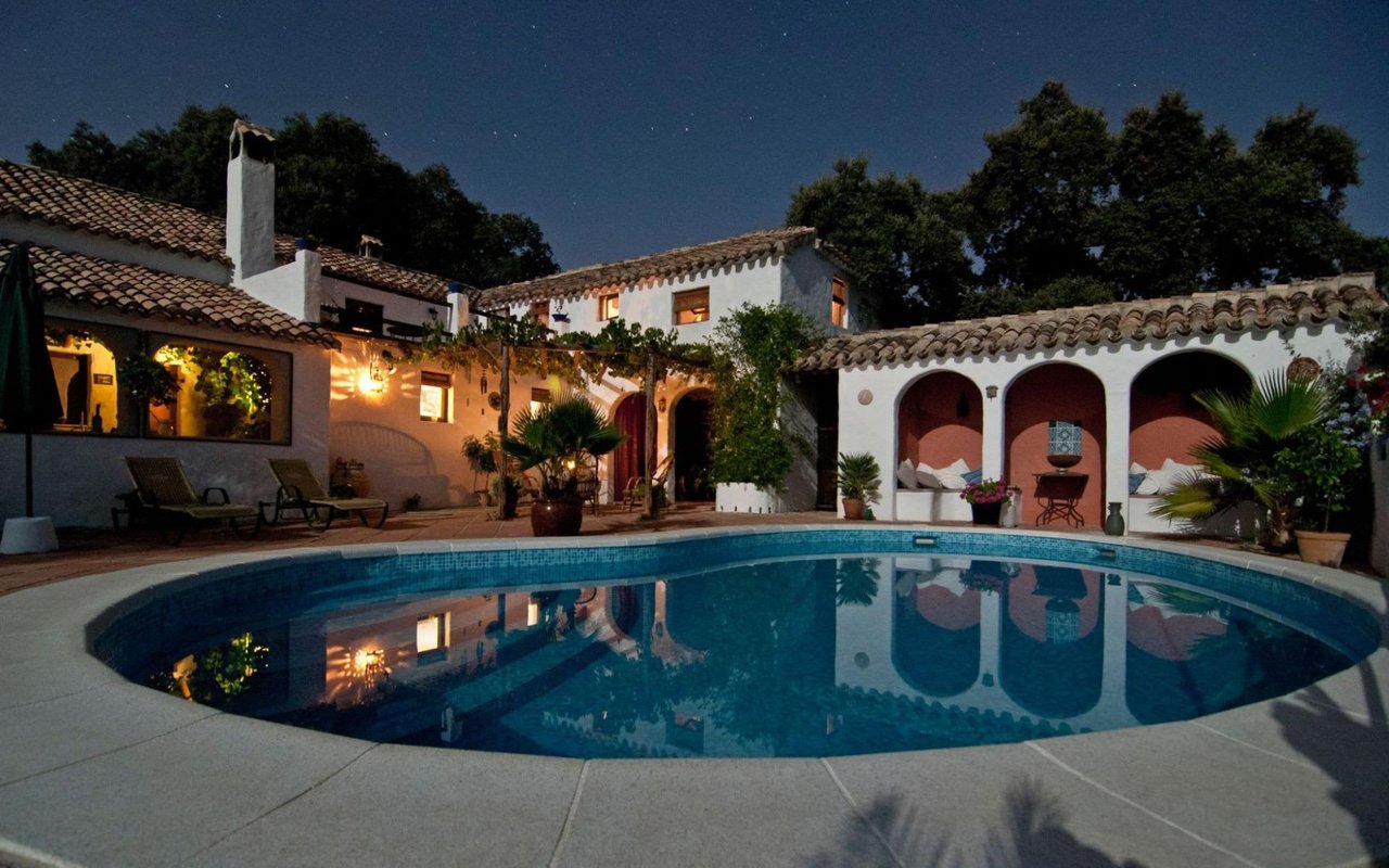
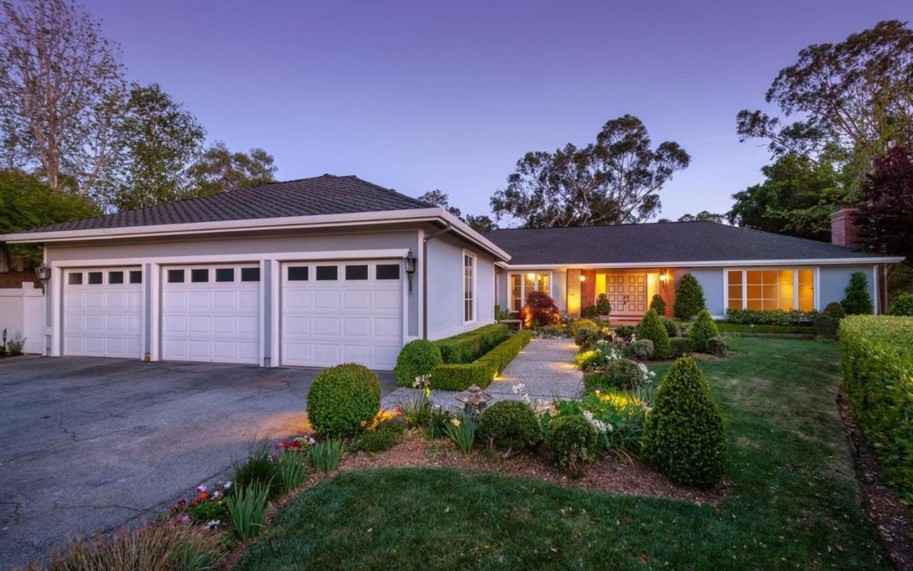
Let the Architecture Lead the Palette
A room should feel like it belongs to the house it sits in. Paint usually works best when it supports the trim, ceiling height, and overall character of the property instead of competing with it.
The architectural cues we use
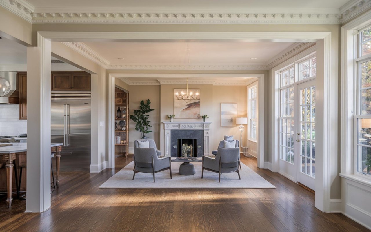
- Traditional homes: Creamier whites, soft taupes, and muted colors often suit older millwork and trim.
- Cleaner-lined spaces: Crisp neutrals and cooler undertones can fit more updated interiors.
- Low-ceiling rooms: Lighter wall colors usually help the room feel more open.
- Detailed trim: Wall colors should highlight the trim rather than overpower it.
This is especially helpful in Burlingame, where many homes already have charm and architectural personality. Good paint lets those details feel more elegant and more current at the same time.
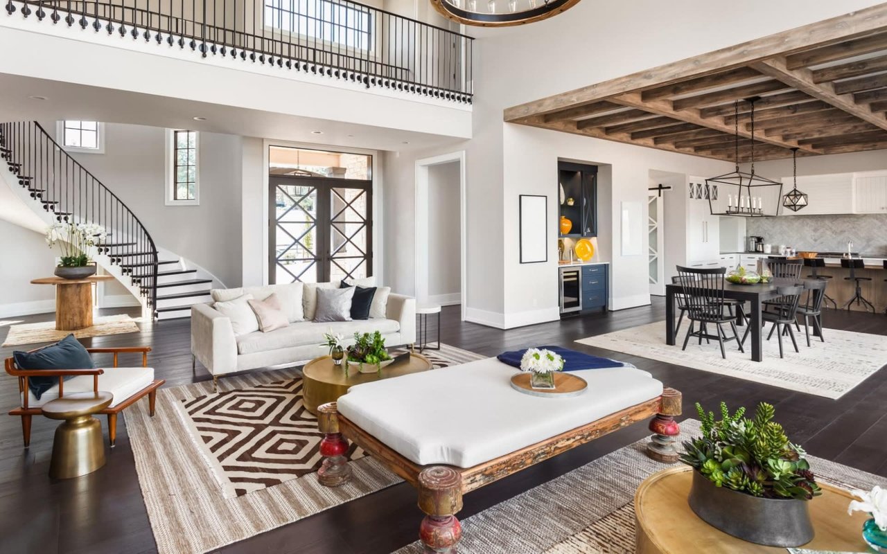
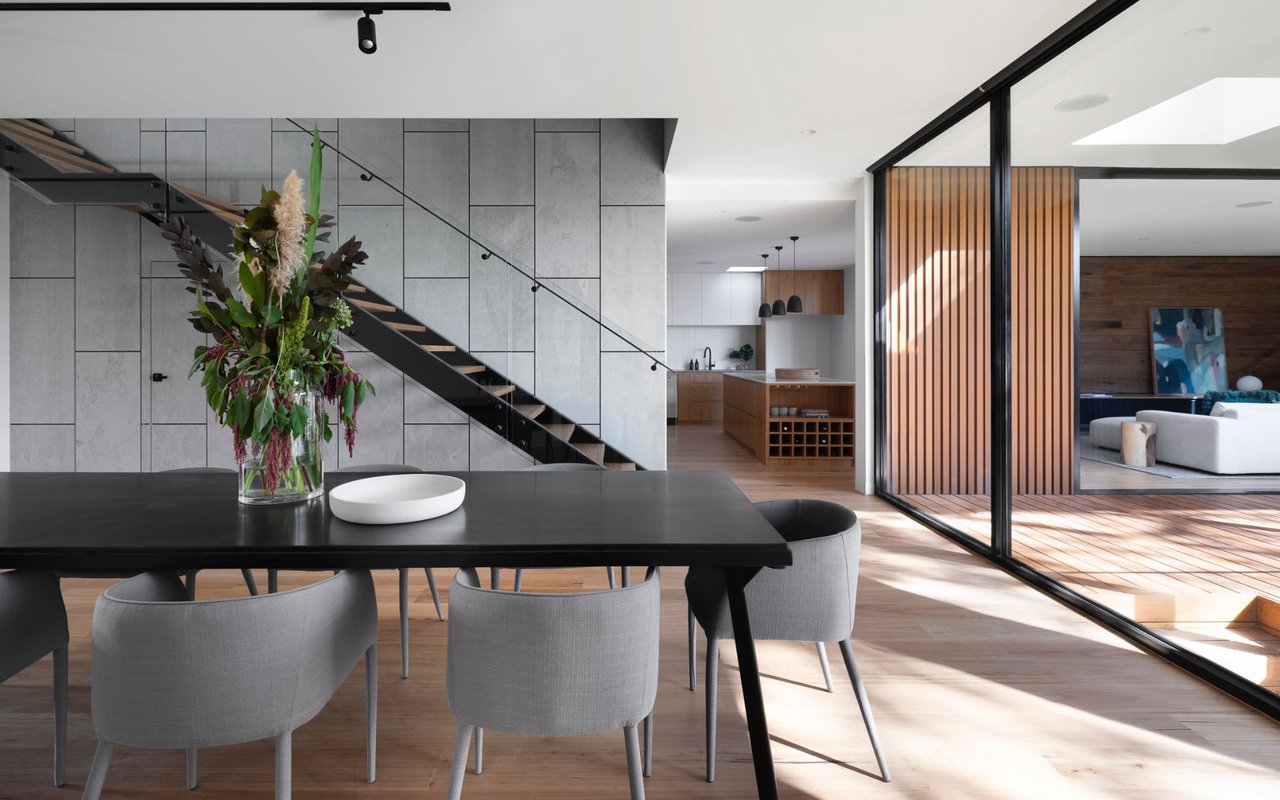
Create Flow Without Repeating the Same Color Everywhere
A connected home does not need one color in every room. The better goal is to create a palette that moves naturally from space to space so the house feels calm and intentional as a whole.
How we keep the palette connected
- One main neutral: A reliable base color can anchor the major living areas.
- Related shifts: Slightly deeper or lighter tones help rooms feel distinct while still belonging together.
- Accent spaces: Dining rooms, powder rooms, and offices can carry a bit more personality.
- Consistent trim: Keeping the trim color steady often makes the house feel more settled.
Flow matters because people notice when a house feels visually easy, even if they cannot immediately explain why.
FAQs
What is the biggest mistake people make with paint?
The most common mistake is choosing a color before understanding the room’s light and undertones. Paint decisions usually get much better once the fixed finishes and time of day are part of the process.
Should every room in the house be the same color?
Usually, a connected palette works better than a single shade throughout the whole home. A little variation gives the house more depth while still keeping it cohesive.
Are lighter colors always better for resale?
Lighter colors are often easier to market, though the best answer still depends on the room and the architecture. Soft, balanced neutrals usually work best because they feel flexible and polished.
Contact Sternsmith Group Today
Paint can quietly change the way a home feels, photographs, and shows, which is why it deserves more thought than people sometimes give it.
Reach out to us at Sternsmith Group today, and we'll help you create a palette that feels natural, elevated, and beautifully aligned with your home.
Reach out to us at Sternsmith Group today, and we'll help you create a palette that feels natural, elevated, and beautifully aligned with your home.